Key Concepts blog task
 Language
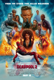
We know it is a film poster because it states "2" which tells us that this is a sequel to the first edition of the movie. We can also interpret that if it says "MAY 18" then that is the release day for the movie or when it will appear in the cinemas. The final thing is on the top it states "FROM THE STUDIO THAT KILLED WOLVERINE" which shows that this studio makes several movies and that makes Deadpool 2 a movie. The key impact on their audiences is that they will look forward to the date "MAY 18" because that is when the movie comes out to the public.
Industries
The studio who made Deadpool 2 is called Marvel Entertainment and the director of the movie is called David Leitch. While Rhett Reese, Paul Wernick and Ryan Reynolds stars in this film. The movie had costed $110 million to make but the profit of the movie was $783.1 million which proves that Industries gets the most profit out anyone else in the media.
Audience
The target audience for the film are teenager / adults because of the violence and bad language used in this movie. This movie also contains some inappropriate jokes that kids are not supposed to see. Also, the film poster shows that there is fire in the background which then makes me interpret that this movie is not child-friendly. For the audience who watched the first part of the movie will be very excited for what the sequel will provide, making them watch this film. This movie might prefer male over female because of how men are stereotyped to be violent and strong even though female actors portray some of the characters.
Representation
In the film poster the characters are the same as the first part that would make the audience excited to see them again. The fire in the background adds a sense of excitement and drama to the audience because it looks intense. They show villains and heroes in the film poster together so that might show a reference to how they might have a huge fight later in the movie which might hype the audience up for the upcoming scenes in the movie.
By Tanish
Comments
Post a Comment